# Compare Slider (/ui/components/react/compare-slider)
## Usage [#usage]
```tsx
import { CompareSlider } from '@appica/ui-react/compare-slider'
```
```tsx
}
after={}
/>
```
`before` shows on the start side of the divider and `after` on the end side, each clipped to its half. Drag the handle, press anywhere, or use the arrow keys. An `` placed directly in a layer fills it. Size the slider with an `aspect-*` or a height, or let it take the size of its images.
## Examples [#examples]
### Default [#default]
A horizontal split at 50%. Name the slider with `aria-label`, and give a decorative layer `alt=""`.
```tsx
import { CompareSlider } from '@appica/ui-react/compare-slider'
export default function CompareSliderDefault() {
return (
}
after={}
/>
)
}
```
### Vertical [#vertical]
`orientation="vertical"` stacks `before` above `after`.
```tsx
import { CompareSlider } from '@appica/ui-react/compare-slider'
export default function CompareSliderVertical() {
return (
}
after={}
/>
)
}
```
### Starting position [#starting-position]
`defaultValue` sets where the divider starts, from `0` (all `after`) to `100` (all `before`).
```tsx
import { CompareSlider } from '@appica/ui-react/compare-slider'
export default function CompareSliderStartingPosition() {
return (
}
after={}
/>
)
}
```
### Reveal on scroll [#reveal-on-scroll]
`reveal` opens on `before` and wipes the divider in to `defaultValue` the first time the slider scrolls into view. Grabbing the divider stops it, and reduced motion skips it.
```tsx
import { CompareSlider } from '@appica/ui-react/compare-slider'
export default function CompareSliderReveal() {
return (
}
after={}
/>
)
}
```
### Labels [#labels]
`beforeLabel` and `afterLabel` caption each side, along the bottom edge or the top with `labelPosition="top"`. A vertical slider puts each label at its own end.
```tsx
import { CompareSlider } from '@appica/ui-react/compare-slider'
export default function CompareSliderLabels() {
return (
}
after={}
/>
)
}
```
### Custom handle icon [#custom-handle-icon]
`icon` replaces the built-in arrow, for example with one from [Appica Icons](/ui/icons). Size it with a `size-*` class, and pick one that matches `orientation`.
```tsx
import { CompareSlider } from '@appica/ui-react/compare-slider'
import { CaretLeftRight } from '@appica/icons-react'
export default function CompareSliderCustomIcon() {
return (
}
aria-label="Compare the wireframe with the finished render"
className="aspect-4/3 w-full max-w-xl"
before={
<>
}
after={}
/>
)
}
```
### Controlled [#controlled]
Pass `value` and `onValueChange` to own the position. `onValueCommitted` fires once a drag or key press ends.
```tsx
'use client'
import * as React from 'react'
import { CompareSlider } from '@appica/ui-react/compare-slider'
import { Button } from '@appica/ui-react/button'
import { ButtonGroup } from '@appica/ui-react/button-group'
const STOPS = [
{ label: 'Wireframe', value: 100 },
{ label: 'Both', value: 50 },
{ label: 'Render', value: 0 },
]
export default function CompareSliderControlled() {
const [value, setValue] = React.useState(50)
return (
)
}
```
### Styling [#styling]
Every part has a `data-slot` to target from the root's `className` (listed in the [API reference](#api-reference)), and the root takes `data-dragging` during a drag. Below, secondary badge labels and a primary line and handle.
```tsx
import { CompareSlider } from '@appica/ui-react/compare-slider'
export default function CompareSliderStyling() {
return (
}
after={}
/>
)
}
```
### Next.js Image [#nextjs-image]
Each layer is a positioning container, so a Next.js `` works in either. Size the slider in `className`, since a filled image has no size of its own.
```tsx
import Image from 'next/image'
import { CompareSlider } from '@appica/ui-react/compare-slider'
export default function CompareSliderNextImage() {
return (
}
after={
}
/>
)
}
```
## RTL [#rtl]
Every Appica UI component supports right-to-left layouts out of the box. Set the `dir` attribute on a container (commonly your `` element) so CSS logical properties resolve correctly, and wrap your tree in `DirectionProvider` so direction-aware behavior follows the same direction.
```tsx
import { DirectionProvider } from '@appica/ui-react/providers/direction-provider'
export default function RootLayout({ children }) {
return (
{children}
)
}
```
In a right-to-left layout `before` moves to the right, the position counts from the right edge, and the arrow keys still follow the divider. See the [RTL guide](/ui/docs/react/rtl) for setup.
## API reference [#api-reference]
`CompareSlider` is a single component. It renders a native range input for the keyboard and assistive technology, and forwards `ref` and remaining attributes to the root element.
| Prop | Type | Default | Description |
| ------------------ | -------------------------------------------- | -------------------- | -------------------------------------------------------------------------------------------------------------------------------- |
| `before` | `ReactNode` | - | Layer on the start side of the divider, or above it when vertical. |
| `after` | `ReactNode` | - | Layer on the end side of the divider, or below it when vertical. |
| `value` | `number` | - | Divider position as a percentage of the way from the start edge (the top when vertical). Pass it to control the component. |
| `defaultValue` | `number` | `50` | Divider position on first render, as a percentage of the way from the start edge, when the component is uncontrolled. |
| `onValueChange` | `(value: number) => void` | - | Fires on every change, including each frame of a drag. |
| `onValueCommitted` | `(value: number) => void` | - | Fires once a drag ends or a key press settles, with the position landed on. |
| `orientation` | `'horizontal' \| 'vertical'` | `'horizontal'` | Axis the divider travels along. Vertical stacks `before` above `after`. |
| `beforeLabel` | `ReactNode` | - | Caption in a corner of the `before` layer, clipped with it as the divider passes. |
| `afterLabel` | `ReactNode` | - | Caption in a corner of the `after` layer, clipped with it as the divider passes. |
| `labelPosition` | `'top' \| 'bottom'` | `'bottom'` | Edge the labels sit along. A vertical slider ignores it and puts each label at its own end. |
| `icon` | `ReactNode` | - | Icon on the handle. Defaults to a double arrow that follows `orientation`. |
| `reveal` | `boolean` | `false` | Open on `before` alone and wipe the divider in to `defaultValue` the first time the slider scrolls into view. Uncontrolled only. |
| `disabled` | `boolean` | `false` | Prevent moving the divider. |
| `aria-label` | `string` | `'Divider position'` | Names the slider for assistive technology. Applied to the range input, as is `aria-labelledby`. |
| `className` | `string` | - | Extra classes on the root, merged via `tailwind-merge`. Size the slider here. |
The root carries `data-slot="compare-slider"`, `data-orientation`, and `data-dragging` / `data-disabled` while those states apply. The parts carry `data-slot` values `compare-slider-viewport`, `compare-slider-before`, `compare-slider-after`, `compare-slider-label`, `compare-slider-divider` and `compare-slider-handle`.
## Accessibility [#accessibility]
- The divider is a native `` with `role="slider"`, labeled by `aria-label` or `aria-labelledby` on the root. Without either it is named "Divider position", so pass a label that says what is being compared.
- **Left / Right** (or **Up / Down** when vertical) move the divider by 1%, **Shift** with an arrow and **Page Up / Page Down** by 10%, and **Home / End** jump to either edge. The keys follow the divider on screen, in a right-to-left layout too.
- The handle shows a focus ring while the slider has keyboard focus.
- Give each image the `alt` text it needs. When `before` only restyles what `after` shows, as a wireframe of the same scene does, mark it decorative with `alt=""`.
- On touch screens a tap moves the divider, while a swipe across its axis scrolls the page instead, so a full-width slider doesn't trap the reader.
- The `reveal` wipe is skipped when the user prefers reduced motion.
 }
/>
```
`before` shows on the start side of the divider and `after` on the end side, each clipped to its half. Drag the handle, press anywhere, or use the arrow keys. An `
}
/>
```
`before` shows on the start side of the divider and `after` on the end side, each clipped to its half. Drag the handle, press anywhere, or use the arrow keys. An `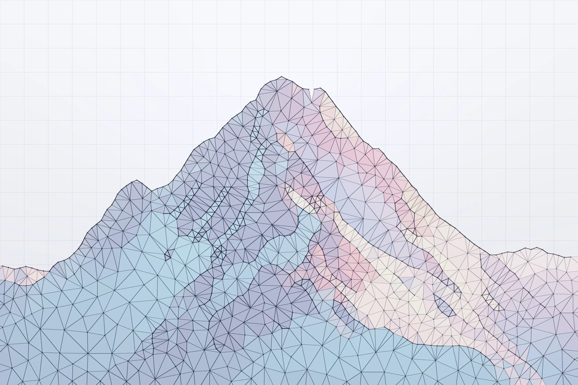
 }
after={
}
after={ }
/>
)
}
```
### Vertical [#vertical]
`orientation="vertical"` stacks `before` above `after`.
```tsx
import { CompareSlider } from '@appica/ui-react/compare-slider'
export default function CompareSliderVertical() {
return (
}
/>
)
}
```
### Vertical [#vertical]
`orientation="vertical"` stacks `before` above `after`.
```tsx
import { CompareSlider } from '@appica/ui-react/compare-slider'
export default function CompareSliderVertical() {
return (