# Preview Card (/ui/components/react/preview-card)


<Playground component="preview-card" />

## Usage [#usage]

```tsx
import { PreviewCard, PreviewCardTrigger, PreviewCardContent } from '@appica/ui-react/preview-card'
```

```tsx
<PreviewCard>
  <PreviewCardTrigger href="https://appica.dev">@appica_ui</PreviewCardTrigger>
  <PreviewCardContent>
    <p className="text-foreground-intense font-semibold">Appica UI</p>
    <p className="text-sm">An accessible React component library.</p>
  </PreviewCardContent>
</PreviewCard>
```

A preview card shows a **rich preview of a link** when a sighted user hovers or focuses it — the avatar, name, and bio behind an `@mention`, or the cover image behind an article link. Unlike a [`Popover`](/ui/components/react/popover), the trigger is a real anchor: `PreviewCardTrigger` renders an `<a>`, so it still navigates on click.

`PreviewCard` is a compound component built on [Base UI's Preview Card](https://base-ui.com/react/components/preview-card):

* **`PreviewCard`** — the root. Holds the open state; opens on hover/focus of the trigger after a short `delay`.
* **`PreviewCardTrigger`** — the inline `<a>` that owns the link. Pass `href` (and `target`, `rel`, …); style it like any link in your prose.
* **`PreviewCardContent`** — the portalled, auto-positioned popup. Draws the card and the optional `arrow`, and accepts the shared [floating props](/ui/components/react/popover) (`side`, `align`, `sideOffset`, …).

<Callout type="note" title="Keep the preview supplementary">
  The popup only appears on hover/focus, so it's invisible on touch and to screen readers — it's a preview of where the
  link goes, not a place for unique or essential content. Anything important should also live on the linked page.
</Callout>

Reach for a `PreviewCard` to **preview a link's destination** inline in text. For interactive floating content from a button, use a [`Popover`](/ui/components/react/popover); for a plain hint, use a [`Tooltip`](/ui/components/react/tooltip); for a menu of actions, use a [`Dropdown Menu`](/ui/components/react/dropdown-menu).

## Examples [#examples]

### Profile preview [#profile-preview]

The classic use: an `@mention` in running text that reveals the person's or organization's profile card on hover — avatar, name, bio, follower count, and a follow action. The trigger stays a real link, so a click still navigates to the profile.

```tsx
import { PreviewCard, PreviewCardTrigger, PreviewCardContent } from '@appica/ui-react/preview-card'
import { Avatar, AvatarImage, AvatarFallback } from '@appica/ui-react/avatar'
import { Button } from '@appica/ui-react/button'

export default function PreviewCardDefault() {
  return (
    <p className="text-foreground-muted text-center">
      Built and maintained by the team at{' '}
      <PreviewCard>
        <PreviewCardTrigger href="#!" className="text-primary font-medium underline-offset-4 hover:underline">
          @appica_ui
        </PreviewCardTrigger>
        <PreviewCardContent className="w-72">
          <div className="flex items-center justify-between">
            <Avatar>
              <AvatarImage src="/avatars/02.jpg" alt="Appica UI" />
              <AvatarFallback>AU</AvatarFallback>
            </Avatar>
            <Button size="sm">Follow</Button>
          </div>
          <div>
            <p className="text-foreground-intense font-semibold">Appica UI</p>
            <p className="text-foreground-muted text-sm">@appica_ui</p>
          </div>
          <p className="text-sm">An accessible React component library built on Base UI, Motion, and Tailwind.</p>
          <p className="text-foreground-muted text-sm">
            <span className="text-foreground-intense font-medium">2,481</span> followers
          </p>
        </PreviewCardContent>
      </PreviewCard>{' '}
      on GitHub.
    </p>
  )
}
```

### Media preview [#media-preview]

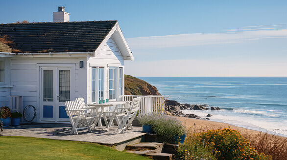
`PreviewCardContent` is just a styled container, so a card can lead with a cover image. Cancel the popup's inner padding with `p-0`, `overflow-hidden` to clip the image to the rounded corners, then pad the text block back in.

```tsx
import { PreviewCard, PreviewCardTrigger, PreviewCardContent } from '@appica/ui-react/preview-card'
import { StarFilled } from '@appica/icons-react'

export default function PreviewCardImage() {
  return (
    <p className="text-foreground-muted text-center">
      Our next offsite is at the{' '}
      <PreviewCard>
        <PreviewCardTrigger href="#!" className="text-primary font-medium underline-offset-4 hover:underline">
          Coastal House
        </PreviewCardTrigger>
        <PreviewCardContent arrow={false} className="w-72 gap-0 overflow-hidden p-0">
          <img src="/preview-card.jpg" alt="Coastal Studio" className="h-41 w-full object-cover" />
          <div className="flex flex-col gap-1 p-4">
            <div className="flex items-center justify-between">
              <p className="text-foreground-intense font-semibold">Coastal House</p>
              <span className="text-foreground-muted flex items-center gap-1 text-sm">
                <StarFilled className="text-warning-emphasis size-4" />
                4.9
              </span>
            </div>
            <p className="text-sm">A bright, open workspace overlooking the bay — room for 24.</p>
          </div>
        </PreviewCardContent>
      </PreviewCard>{' '}
      next month.
    </p>
  )
}
```

### Side & alignment [#side--alignment]

Position the card with `side` (`top` / `right` / `bottom` / `left`) and `align` (`start` / `center` / `end`) on `PreviewCardContent`. It flips and shifts automatically to stay in view.

```tsx
import { PreviewCard, PreviewCardTrigger, PreviewCardContent } from '@appica/ui-react/preview-card'

const PLACEMENTS = [
  { side: 'top', align: 'start' },
  { side: 'right', align: 'center' },
  { side: 'bottom', align: 'end' },
  { side: 'left', align: 'center' },
] as const

export default function PreviewCardPlacement() {
  return (
    <div className="flex flex-wrap items-center justify-center gap-x-6 gap-y-3">
      {PLACEMENTS.map(({ side, align }) => (
        <PreviewCard key={`${side}-${align}`}>
          <PreviewCardTrigger href="#!" className="text-primary text-sm font-medium underline-offset-4 hover:underline">
            {side} / {align}
          </PreviewCardTrigger>
          <PreviewCardContent side={side} align={align}>
            <p className="text-foreground-intense font-semibold">
              {side} / {align}
            </p>
            <p className="text-sm">The card flips and shifts automatically to stay in view.</p>
          </PreviewCardContent>
        </PreviewCard>
      ))}
    </div>
  )
}
```

### Without an arrow [#without-an-arrow]

Pass `arrow={false}` to drop the pointer for a flatter card that sits a little closer to the link.

```tsx
import { PreviewCard, PreviewCardTrigger, PreviewCardContent } from '@appica/ui-react/preview-card'

export default function PreviewCardNoArrow() {
  return (
    <p className="text-foreground-muted text-center">
      Read more in the{' '}
      <PreviewCard>
        <PreviewCardTrigger href="#!" className="text-primary font-medium underline-offset-4 hover:underline">
          getting started
        </PreviewCardTrigger>
        <PreviewCardContent arrow={false} className="w-64">
          <p className="text-foreground-intense font-semibold">Getting started</p>
          <p className="text-sm">Install the package, import the styles, and drop your first component in.</p>
        </PreviewCardContent>
      </PreviewCard>{' '}
      guide.
    </p>
  )
}
```

## RTL [#rtl]

Every Appica UI component supports right-to-left layouts out of the box. Set the `dir` attribute on a container (commonly your `<html>` element) so CSS logical properties resolve correctly, and wrap your tree in `DirectionProvider` so direction-aware placement follows the same direction.

```tsx
import { DirectionProvider } from '@appica/ui-react/providers/direction-provider'

export default function RootLayout({ children }) {
  return (
    <html lang="ar" dir="rtl">
      <body>
        <DirectionProvider dir="rtl">{children}</DirectionProvider>
      </body>
    </html>
  )
}
```

The card anchors from the trigger's leading edge and `start`/`end` alignment mirrors. For setup details and caveats, see the [RTL guide](/ui/docs/react/rtl).

<Callout type="note" title="Scoped RTL needs the direction on the positioner">
  The popup portals to `<body>`, so its `start`/`end` alignment mirrors from the **document** direction (read from CSS,
  not from `DirectionProvider`) — automatic when `<html dir="rtl">`. If you instead scope RTL to a subtree of an LTR
  page, set it on the positioner so alignment still mirrors: `<PreviewCardContent positionerProps={{ dir: 'rtl' }}>`.
  See [Floating popups in a scoped RTL region](/ui/docs/react/rtl#floating-popups-in-a-scoped-rtl-region).
</Callout>

<RtlPreview component="preview-card" />

## API reference [#api-reference]

`PreviewCard` wraps [Base UI's Preview Card](https://base-ui.com/react/components/preview-card). Each part forwards every remaining prop to the matching Base UI primitive, so anything it accepts works here — the tables below list the Appica additions and the most common props. See the Base UI docs for the complete API.

### PreviewCard [#previewcard]

The root. Holds the open state; renders no DOM of its own.

| Prop                   | <ColMinWidth width="200">Type</ColMinWidth> | Default | <ColMinWidth width="220">Description</ColMinWidth>     |
| ---------------------- | ------------------------------------------- | ------- | ------------------------------------------------------ |
| `open`                 | `boolean`                                   | —       | Controlled open state. Pair with `onOpenChange`.       |
| `defaultOpen`          | `boolean`                                   | `false` | Uncontrolled initial open state.                       |
| `onOpenChange`         | <Code>(open, eventDetails) => void</Code>   | —       | Fires when the card opens or closes.                   |
| `onOpenChangeComplete` | `(open) => void`                            | —       | Fires after the open/close transition finishes.        |
| `actionsRef`           | `RefObject`                                 | —       | Imperative handle to `close()` / `unmount()` the card. |

### PreviewCardTrigger [#previewcardtrigger]

The inline anchor that owns the link. Forwards Base UI's `PreviewCard.Trigger` (and every native `<a>` prop); use `render` to project it onto your router's link.

| Prop         | <ColMinWidth width="220">Type</ColMinWidth>                 | Default | Description                                               |
| ------------ | ----------------------------------------------------------- | ------- | --------------------------------------------------------- |
| `href`       | `string`                                                    | —       | Navigation target.                                        |
| `delay`      | `number`                                                    | `600`   | Hover-open delay in ms.                                   |
| `closeDelay` | `number`                                                    | `300`   | Hover-close delay in ms.                                  |
| `render`     | <Code>ReactElement \| (props, state) => ReactElement</Code> | —       | Render the link as your own element (e.g. a router link). |
| `className`  | `string`                                                    | —       | Extra classes on the link, merged via `tailwind-merge`.   |

### PreviewCardContent [#previewcardcontent]

The portalled, auto-positioned popup. Draws the card and the optional arrow, and accepts the shared floating props. Defaults to `side="bottom"`, `align="center"`, and `sideOffset={10}` (or `6` without an arrow).

| Prop               | <ColMinWidth width="160">Type</ColMinWidth>         | Default    | Description                                                            |
| ------------------ | --------------------------------------------------- | ---------- | ---------------------------------------------------------------------- |
| `arrow`            | `boolean`                                           | `true`     | Render the pointer and the thicker anchored border.                    |
| `side`             | <Code>'top' \| 'right' \| 'bottom' \| 'left'</Code> | `'bottom'` | Preferred side to open on.                                             |
| `align`            | <Code>'start' \| 'center' \| 'end'</Code>           | `'center'` | Alignment along that side.                                             |
| `sideOffset`       | `number`                                            | `10`       | Gap between the link and the card.                                     |
| `alignOffset`      | `number`                                            | `0`        | Shift along the alignment axis.                                        |
| `collisionPadding` | `number`                                            | `5`        | Minimum gap kept from the viewport edge when flipping/shifting.        |
| `anchor`           | <Code>Element \| ref \| VirtualElement</Code>       | —          | Anchor against a different element than the trigger.                   |
| `container`        | <Code>HTMLElement \| ref \| null</Code>             | —          | Portal target — render the popup into a different node.                |
| `keepMounted`      | `boolean`                                           | `false`    | Keep the popup mounted in the DOM while closed.                        |
| `positionerProps`  | `object`                                            | —          | Escape hatch for the positioner element (`style`, `render`, `dir`, …). |
| `portalProps`      | `object`                                            | —          | Escape hatch for the portal element (`style`, `render`, …).            |
| `className`        | `string`                                            | —          | Extra classes on the card.                                             |

## Accessibility [#accessibility]

* The trigger is a real `<a>`, so it's keyboard-focusable and navigates on click; the preview opens on hover **and** focus.
* The popup is supplementary — it's not announced as the link's name, and it doesn't appear on touch — so don't hide unique or essential content in it.
* **Escape** closes an open card; moving focus or the pointer away closes it after `closeDelay`.
* Enter/exit transitions are skipped when the user prefers reduced motion.