Compare Slider
Two layers split by a draggable divider, for before and after comparisons.
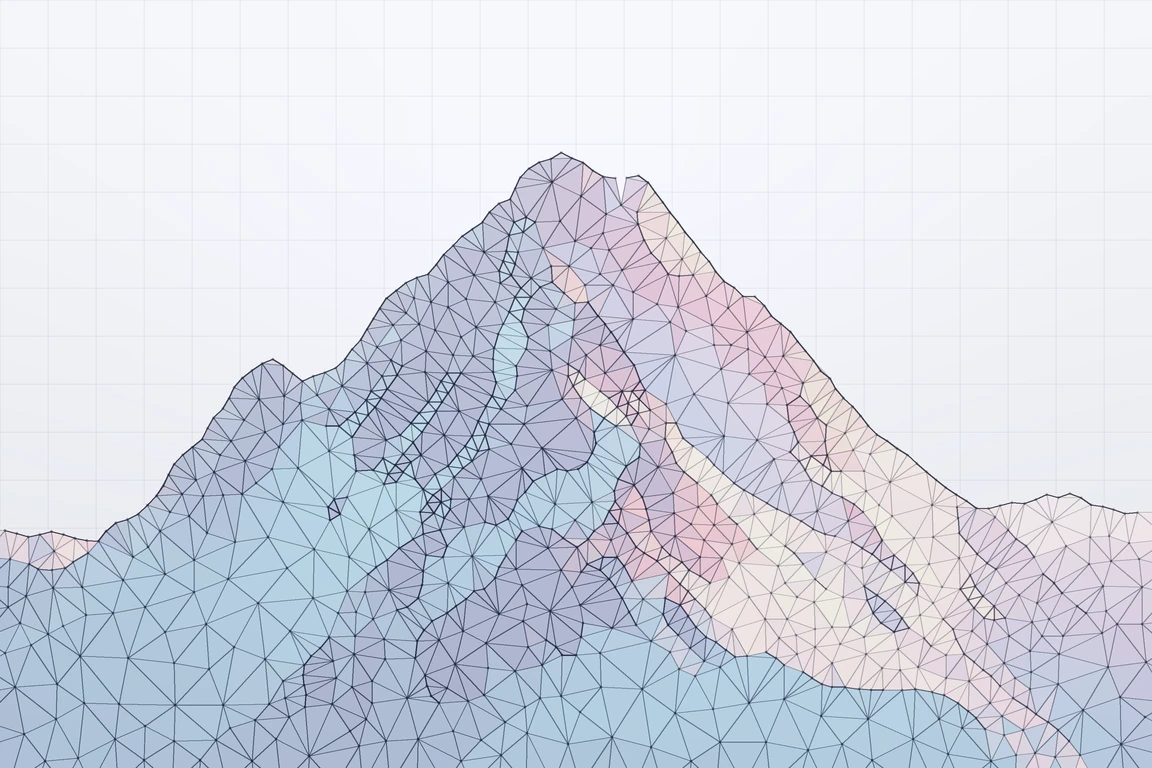
 Wireframe
 Render
Usage
before shows on the start side of the divider and after on the end side, each clipped to its half. Drag the handle, press anywhere, or use the arrow keys. An <img> placed directly in a layer fills it. Size the slider with an aspect-* or a height, or let it take the size of its images.
Examples
Default
A horizontal split at 50%. Name the slider with aria-label, and give a decorative layer alt="".
Vertical
orientation="vertical" stacks before above after.
Starting position
defaultValue sets where the divider starts, from 0 (all after) to 100 (all before).
Reveal on scroll
reveal opens on before and wipes the divider in to defaultValue the first time the slider scrolls into view. Grabbing the divider stops it, and reduced motion skips it.
Labels
beforeLabel and afterLabel caption each side, along the bottom edge or the top with labelPosition="top". A vertical slider puts each label at its own end.
Custom handle icon
icon replaces the built-in arrow, for example with one from Appica Icons. Size it with a size-* class, and pick one that matches orientation.
Controlled
Pass value and onValueChange to own the position. onValueCommitted fires once a drag or key press ends.
Styling
Every part has a data-slot to target from the root's className (listed in the API reference), and the root takes data-dragging during a drag. Below, secondary badge labels and a primary line and handle.
Next.js Image
Each layer is a positioning container, so a Next.js <Image fill> works in either. Size the slider in className, since a filled image has no size of its own.
RTL
Every Appica UI component supports right-to-left layouts out of the box. Set the dir attribute on a container (commonly your <html> element) so CSS logical properties resolve correctly, and wrap your tree in DirectionProvider so direction-aware behavior follows the same direction.
In a right-to-left layout before moves to the right, the position counts from the right edge, and the arrow keys still follow the divider. See the RTL guide for setup.
نموذج سلكيالصورة النهائيةAPI reference
CompareSlider is a single component. It renders a native range input for the keyboard and assistive technology, and forwards ref and remaining attributes to the root element.
The root carries data-slot="compare-slider", data-orientation, and data-dragging / data-disabled while those states apply. The parts carry data-slot values compare-slider-viewport, compare-slider-before, compare-slider-after, compare-slider-label, compare-slider-divider and compare-slider-handle.
Accessibility
- The divider is a native
<input type="range">withrole="slider", labeled byaria-labeloraria-labelledbyon the root. Without either it is named "Divider position", so pass a label that says what is being compared. - Left / Right (or Up / Down when vertical) move the divider by 1%, Shift with an arrow and Page Up / Page Down by 10%, and Home / End jump to either edge. The keys follow the divider on screen, in a right-to-left layout too.
- The handle shows a focus ring while the slider has keyboard focus.
- Give each image the
alttext it needs. Whenbeforeonly restyles whataftershows, as a wireframe of the same scene does, mark it decorative withalt="". - On touch screens a tap moves the divider, while a swipe across its axis scrolls the page instead, so a full-width slider doesn't trap the reader.
- The
revealwipe is skipped when the user prefers reduced motion.